Visualizing SPARQL Graph Pattern
At the end of last month there was a discussion on Twitter which was started by one of the Uniprot developers asking whether there is a tool to make diagrams from SPARQL queries. The request arose from the need to support the creation of visual material for RDF/SPARQL training – an activity which is performed manually.

Caption: Fig 1. Tweet from Uniprot developer

Caption: Fig. 2 example of hand-drawn diagram of graph pattern of the SPARQL query
In the Semantic Web research area this problem is not new. However, the solutions were either incorporated into bigger tools (query interfaces or query builders) or tied to a particular SPARQL endpoint. Currently there is no turnkey tool which can accept a SPARQL query without accessing any SPARQL endpoint and showing the visual representation of the (graph pattern of that) query.
One of our group members, Peb, saw this tweet and devised a python script to generate the graph pattern visualization from the example query above. The script uses rdflib, a python library to parse the SPARQL query and pygraphviz to generate the graph visualization using the popular graphviz tool suite.
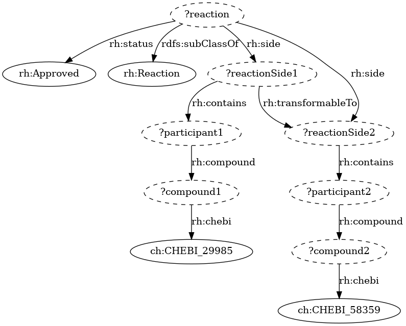
Caption: Fig. 3. The result of visualization generated by our tool
Currently, the tool is available in a github gist here. To use the tool, download the file as a python script and run it. It assumes that rdflib and pygraphviz are already installed. If not, one can install it using pip from the command line (pip install rdflib pygraphviz). To run the script from the command line terminal, put the sparql query in a text file (e.g. query.rq) and use the following command:
python3 sparqlqueryviz.py -i query.rq
To conclude, here is an example of SPARQL graph pattern visualization from a query on Wikidata to get the last 2 numbers of COVID-19 cases from all countries.
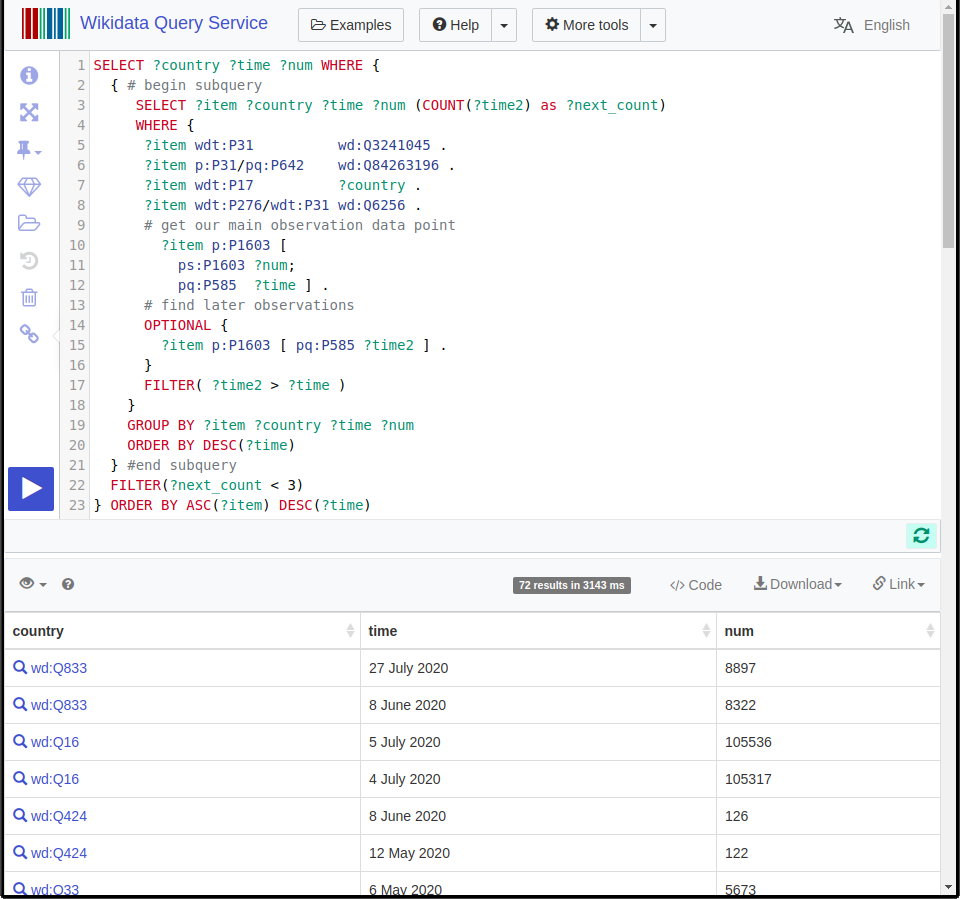
Caption: Fig. 3. Example query on Wikidata for last 2 numbers of cases from all countries
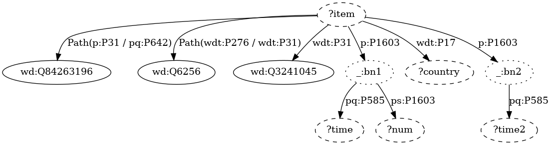
Caption: Fig. 4. The visualization output from the query on Wikidata